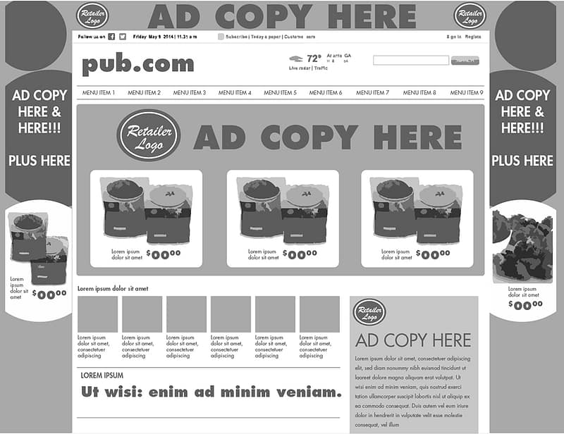
When a potential customer walks into your brick and mortar location or visits your website, they should know where they are. At a bare minimum, they should at least know your industry. Take the following anonymized, to scale, low-fi recreation of a real home page as an example.
Welcome to this retailer’s home page. Be sure to check out our amazing deals on cereal and frozen strawberries.
Uhhhh, wait, what? This is the landing page for the leading newspaper in a large American city. Don’t believe me? Located near the top left, you’ll find “pub.com.” That small url and navigation surrounded by the advertiser logo and brand colors is the only visual clue as to where you are. This news outlet has sacrificed their logo placement, hierarchy, and their brand colors. To generate more revenue, they have diluted their brand. By weakening their brand, they have reduced their brand equity. By lowering the value of their brand equity, they may lose readership and the value placed on advertising on their homepage. The downward spiral begins.
Don’t be like them. We help mid size and small businesses around Roswell and East Cobb build their brand equity with well thought out web design.