
Small businesses around Roswell, GA are learning website tips and tricks from big business short comings. Improve your UI and UX with a little thought and even less effort.
Technical limitations may have resulted in these solutions. However, a more elegant solution was surely possible. We offer other options below, but these may not have worked within the limitations of their respective environments.
This post intends to educate, not shame. Therefore, the content below is anonymized.
Bank login:
First up is the login UI for a large bank.
Credit where credit is due, overall, this website is fantastic. People have a lot of bad feelings towards the megabanks, but this website showcases the kind of features that power and money can buy. Except, the following window trips me up almost every time I use it. I’ve finally learned to slow down and think about what I am doing when I encounter it. However, for the sake of usability, I shouldn’t need to think.
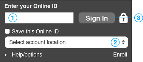
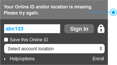
In Figure 1, the natural tendency is to fill out the Online ID and click “Sign In.” That seems easy enough. Step one immediately followed by step two. Wrong! You forgot to “Select account location,” as shown by the error message in Figure 2. These form fields violate the simple 1-2-3 linear process that we rely on in most aspects of our lives. Instead, the user interface designers want you to follow an unnatural 1-3-2 upside down triangle process by filling out the online ID, going down to select account location, then back up to sign in.
Part of this is my fault. I prefer to browse with either private browsing turned on, or I clear my history religiously after every few websites. Sure clearing my history provides a false sense of security, but it makes me feel better. In fairness to the user interface designers, if I never cleared my history, this would only be an issue the first time I logged in, not every time.
All things considered, I am the user, and this is about me, not the UI designers.
Therefore, I propose the following solution in Figure 3. Place the various fields in an order that makes sense. Select account location, Enter Online ID, Sign In. This follows the chronological process we expect.
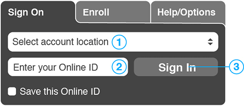
During the process of changing up the field order, other inconsistencies became apparent. Within the original screen grab, “Enter your Online ID” is above the form field and “Select account location” is within the form field. In the interest of simplification, both descriptors get placed within the form field.
Also, “Enroll” had been tucked down in the bottom right. Ease of enrolling is crucial to the overall user experience. Second only to being able to log in. By moving it up to a tab next to “Sign in,” we increase visibility. The same thing can be said for moving “Help/Options” up to a tab. Moving “Help/Options” up also has the added benefit of removing the expandable triangle. This little window already had a text field, button, checkbox, drop down, expandable triangle, and link. The new user interface has far fewer types of user input. Plus the padlock was removed next to the Sign In button. Most of us know how passwords work, and the only padlock that we need to see is the one in the URL bar.
Lessons for local small businesses:
Small businesses around North Atlanta and Roswell can use these lessons to improve their own website design.
Yes, this is the user interface for a megabank, but the lessons are still applicable to your small business. For example, watching users interact with your site, you are likely to see them repeatedly make the same errant interactions. When different users frequently make the same mistake, it’s not a user problem. It’s a design problem.
Entertainment login:
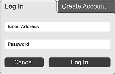
Next on our list is the login interface for an entertainment website.
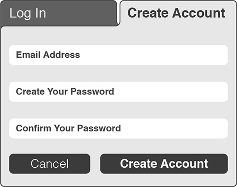
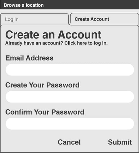
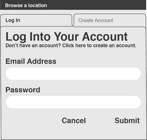
After clicking “Log In” in the top right of Figure 4, why is the user taken to the “Create Account” tab in Figure 5? I consistently (and wrongly) enter my info in the “Create Account” fields assuming I’m on the Log In page. My mistake is only obvious upon encountering the “Confirm Your Password Field.” Then I’m forced to click the “Log In” tab and re-enter my info in the appropriate fields in Figure 6. Plus, the rules around the tabs intersect one another, rather than the foreground tab blocking out the background rule. Further confusing what tab I’m on.
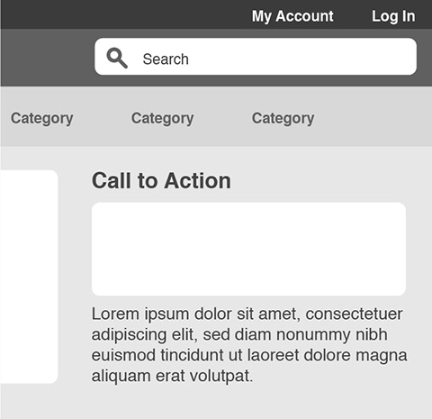
The original bar at the top of the home page contained “My Account” and “Log In.” Both links directed you to the same place. In Figure 7, “My Account” has been removed and “Create Account” has been added next to “Log in” with each link taking the user to the appropriate page. Also, “Browse a Location” has been added. Initially, “Browse a Location” was on the top of the “Log In” and “Create Account” tabs potentially distracting users from accessing the site.
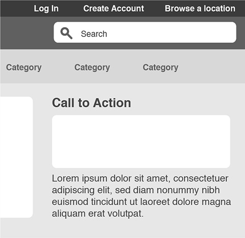
In Figure 8 and 9, the “Log In” and “Create Account” tabs are enhanced to indicate better which one is active. “Browse a Location” moves to the home page, and the overall UI is cleaned up.