Jason Wiggins Creative
Menu
Jason Wiggins Creative
We’ve been through an evolution of logos that while technically sound, didn’t push far enough for us. In 2013, it was finally time to finish this thing.
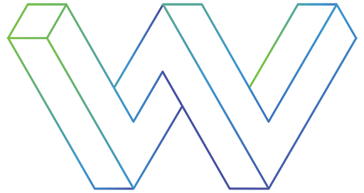
A logo of a three-dimensional letter form contorted into impossible perspective. After scores of brainstorms and filling sketchbooks, we realized we were overthinking it. We started moving around some shapes and had some success with the hexagon. The hexagon pulled into elongated shapes began to form the current mark. As we began to combine those shapes, we decided to play with a bit of impossible perspective. The direction was working, but we weren’t crazy about the chunkiness of it.
By outlining the edges and bringing in some vibrant to dark gradients, we were able to keep the thickness of the concept but with the appearance of a much lighter modern letterform. A lighter, airier shape was vital to keep it from overpowering the thinner typefaces that would be accompanying the mark.
As this website was going into the design phase, we had to seriously consider changing up the logo and how the rest of the site would relate to it. When we developed the logo back in 2013, we liked the gradient and applied it to most of our materials. In the images of our old website below, you can see some samples of how we used those gradients.
Fast forward five years to the fall of 2018 and gradients are everywhere. And not just any gradient, our gradient. We grew concerned that we might fade into a sea of similar colors. We still think that as the gradient fad fades, our existing site may appear dated sooner. Ultimately, we decided our logo and colors are working well for us, and we aren’t going to let similar looks sway us.

The next challenge we came across was the structure and design of this site. With some great apps and plugins, making custom design faster and easier than even just a few years ago, we wanted to push the layout hard. However, a large portion of this website is built to educate businesses about new concepts. Putting those uncommon terms and ideas into an experimental layout, they are even harder to understand. So for the sake of educating and consistency, we decided to make the design very straightforward.
The site is also composed of two distinct but related offerings — the first being branding and design, and the second is distributed marketing. If someone was to land on one section of the site, we wanted them to be immediately aware of the other content, so we included cross-links between the topics. This way, if someone is looking for a logo and they happen to land on distributed marketing, they won’t give up and leave.
Adobe XD did much of the heavy lifting as we experimented with the architecture described above. The ability to create fast, clickable, lo-fi mockups and make rapid iterations was a game-changer. Here are some demo videos of one of those iterations. The first is the mobile wireframe and the second is for desktop.
XD is a practical, low cost, and faster option to work through ideas with clients. By keeping colors and content to a minimum, the client can stay focused on the site structure and function. This process helps prevent clients from getting hyper-focused on stylistic issues.
“But wait, there's more!”
Like a lot of creatives, we aren’t down with the hard sell on our materials. All of our sites up until this point have primarily been portfolios with a contact page. This time around, we decided to step out of our comfort zone and load up on calls-to-action. You can see this when looking at the Distributed Brands and Marketing page.
Most are unfamiliar with distributed brands and marketing, and the name only makes sense after learning about it. So we started with a header that quickly describes the benefit. Immediately following are bullets of qualifiers and pain points for quick scanning. Then, we briefly define distributed marketing along with a few advantages and a call-to-action. If the reader hasn’t heard enough to click on the CTA, they can dive into the information that immediately follows. As a reader scans down the page, there are multiple points to pull them back in with big headlines, stats, images, reasons to believe, etc. Then, at the very bottom, are additional CTAs and options to learn even more.
We followed similar practices throughout the rest of the site. To test the effectiveness, the calls-to-action, and website in general, are set up for analytics. We hope to update this case study once we have a large enough data set to report. So check back in later.