Jason Wiggins Creative
Menu
Jason Wiggins Creative
Like most industries, construction has more than a few bad logos. However, maybe due to the creative eye of architects, the sector has more than its fair share of outstanding logos. In other words, this one had to shine more than most.
Yes, as you may have guessed by the name, this was done for our founder’s father. Nepotism aside, this logo has performed exceptionally well.
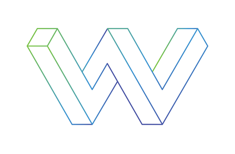
Rick Wiggins had the good fortune of sharing the same last name as our founder. We’ve spent an unhealthy amount of time contemplating the letter W, and he reaped the benefits. We worked on a similar concept for our organization but could not find an industry tie-in. When Rick said he was looking for a new logo, we immediately knew the direction to go. However, the details still had not been worked out.
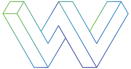
After much experimentation, the buildings began to take shape. They started opaque, but due to a happy accident, they took a turn towards transparency. Beyond infusing them with a more modern look, the transparency allowed for a much more dynamic perspective. The audience view of a logo is typically at eye level and straight ahead. Here, we are given a birds-eye view of the logo, and it’s set at an angle. This serves as a unique visual treat for the audience and represents two gleaming buildings.
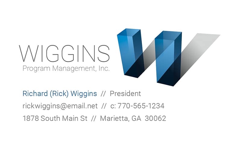
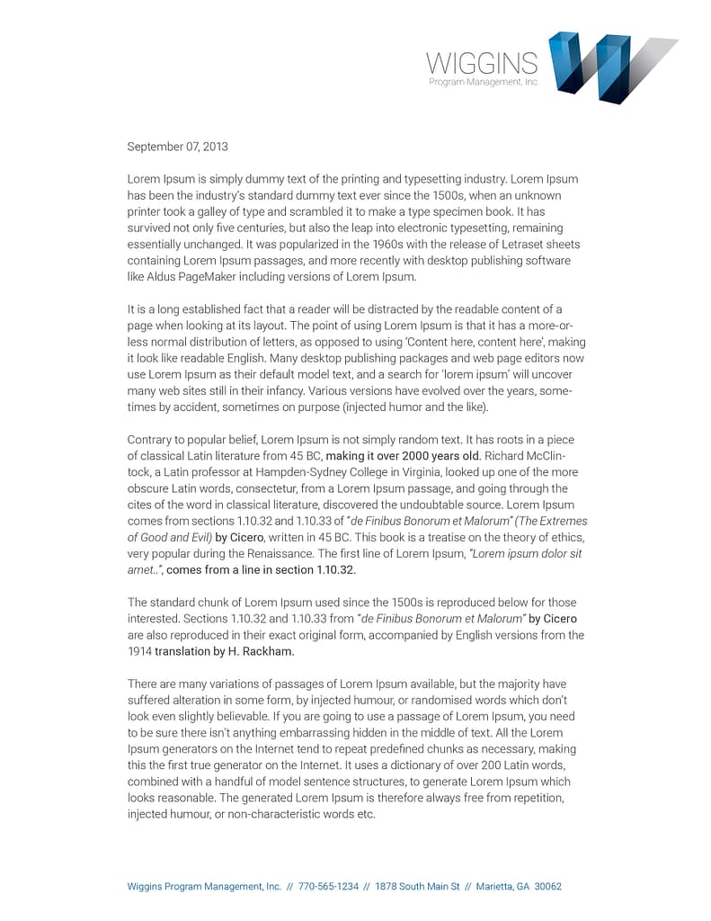
This logo can stand on its own such as when placed on a gradient. This technique delivers a great deal of depth to something as small as a business card. In contrast, using the mark on a flat white surface set next to typography also creates an exciting visual play from two-dimensional to three-dimensional forms.
It never gets old seeing the delight on faces as viewers’ minds put together the W out of the buildings casting shadows.

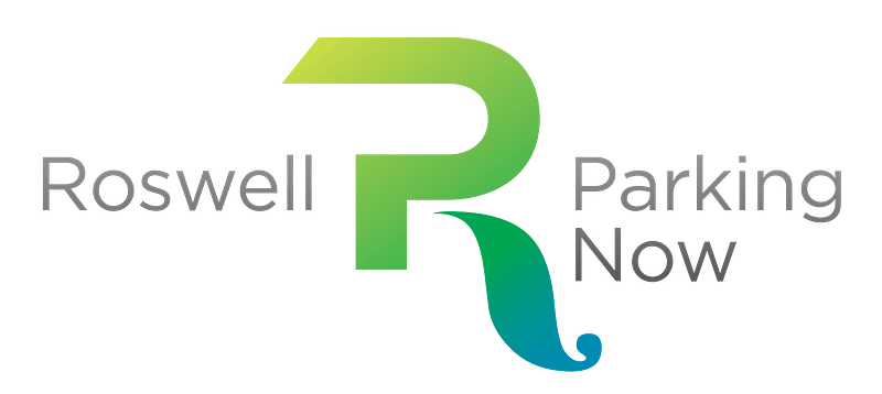
Roswell Parking Now is an initiative led by local businesses and patrons to push the city to build a parking deck. For the Roswell Historic District to continue to compete with Live/Work/Play developments popping up in the area, it’s necessary to solve the parking crunch.
To represent both Roswell’s historical past and current status as a forward-thinking community, we combined a classic leg from a serif R with the more modern form of a san serif P.
Due to Roswell’s history as a mill town, almost every other logo with the city’s name incorporates a water wheel. We avoided that cliché but still pay homage to our past by using a very fluid leg for the R. We also filled it with a gradient from green to blue to make it look even more like water flowing out of a sluice.
Create a sub-brand for IronHouse Fitness that’s focused on a proprietary training regimen.
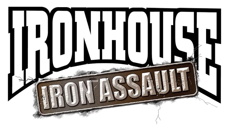
This look started as a vector in Illustrator. To achieve the photorealistic look of a worn piece of forged iron with a heavy patina, we brought the vector into Photoshop. Understanding the potential future resolution limitations of a raster logo, we worked it at a very high resolution once rasterized.
The final touch involved using the original IronHouse logo and then making it look like the Iron Assault “Badge” had been dropped onto it, resulting in a cracked surface. This extra step leaves us with a lockup that looks cohesive as opposed to the original IronHouse logo with an unrelated badge just placed underneath it.
The owner of this gym wanted a logo that had a bull in it.
Blood splatter! Looking at this logo, you can imagine the brutal contact. As previously mentioned, the gym owner wanted a logo with a bull in it. We showed some interesting stuff over a few months, and they all got shot down. Sometimes what someone wants isn’t the same as what they think they want. We continued to execute what he was asking for and slipped this one into the mix. He took this one as is, with zero revisions.
Shorten the rather long name Waddell, Smith, Magoon, and Freeman and create a logo that can work in a variety of mediums.
On the surface, this looks like a simple solution, but it took some time to get here. With such a long, authoritative name, creating something friendly, but still professional was important.
Likely because of tradition, accounting firms tend to stick to serif typefaces. The decision was made to use this serif face that has a bit more of a humanist flair with thick and thin strokes and less angular serifs.
Then came the issue of spacing; the white space between the letters was causing them to look unrelated. Pushing them together gave us more cohesion, but the side-by-side stems of the M and the F were disturbing the rhythm. By tweaking the letterforms and merging the two stems, we come to our final, friendly, professional, and rhythmically balanced logo.
We’ve been through an evolution of logos that, while technically sound, didn’t push far enough.
During development, design trends were going towards very light grays, whites, and blacks. Everything was clean, flat, and minimal, and we wanted to zig while everyone else zagged. The current gradient trend did not start until about five years after this logo was developed.
During early creative development, we were contemplating all the twists and turns that not just our careers, but the entire industry was going through. Flexibility is vital if you are going to survive as a creative in this current market. This creative direction started to reveal itself by using a bit of impossible perspective. The direction was working, but we weren’t crazy about the chunkiness of the mark.
By outlining the edges and bringing in some vibrant to dark gradients, we were able to keep the thickness of the concept but with the appearance of a much lighter, modern letterform. A lighter, airier shape was vital to keep it from overpowering the thinner typefaces that would be accompanying the mark.
For more on our brand, check out our Branding and Design Case Study.