Distributed marketing case study.
Challenge:
Assist an enterprise consisting of several corporations in the transition from an existing platform to a new system built by a different provider. Then create and manage all the content for the new system.
Solution:
The problem was technical, but getting people to understand took some creativity. The client and new provider thought things were proceeding smoothly. But as the launch approached, we noticed red flags. When we brought this to everyone’s attention, they didn’t see the issue. Our team persisted, and we put together a demo video illustrating exactly how we used our existing platform.
At that point, it became clear that the developers of the new platform were not familiar with our current tool or how we used it. After our presentation, everyone understood the challenge at hand. By getting everyone on the same page, we saved countless hours and budget and exceeded client expectations.
Results:
Thanks to the efficiencies of the templates we create and manage, the client estimates they avoided hiring three additional brand managers.
Plus, they saw a 395% increase in consumer-facing downloads year-over-year with an estimated savings of $32M on agency-quality, well-branded materials. Those aren’t our numbers; those come from the client. We feel $32M is aggressive as it seems based on unique, above-the-line creative, and the system is producing below-the-line one-offs. However, it’s difficult to argue with the year-over-year increase in usage as well as some substantial financial savings.
increase in downloads
year-over-year
saved on agency creative
Template refresh with new features
Launch, evaluate, iterate, improve, repeat.
With each brand refresh, we take the opportunity to get the templates up to current brand standards, as well as make iterative improvements. We look at the reporting we’ve built into the templates to understand their usage. From there, we make the necessary adjustments. Sometimes those adjustments are for content, and other times we add or remove templates or sizes.
With the most recent brand refresh, we made the templates much more powerful. We enhanced the reporting features, provided additional size outputs from templates, added more typefaces, photography, logos, and color options.
Overall there are around 40 templates in this round, each with varying degrees of customization and outputs. Some have multiple preapproved, standard sizes. Others are elastic and can scale and shift ratios to fit exact dimensions input by the user. The templates vary from large print signage to digital signage, print ads, web banners, and responsive HTML emails.
Email templates:

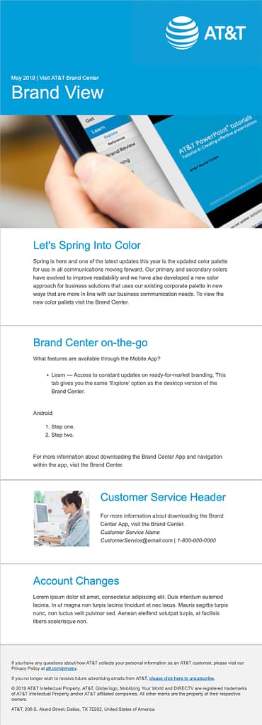
Designer/developers that create responsive emails understand the unique challenges of this medium. Add this project’s customizable nature and its exponential variables, and you have a beast of a challenge on your hands.
This phase of the project consists of multiple responsive emails, each with a unique look but with the same primary functions and content.
Each layout has a header with logo options followed by four content areas (Promotional, Informational, Customer Service, and Account Info). Only one content area is required for distribution. Also, content areas are rearrangeable into different combinations and orders. For example, all four content areas can be informational. Or, the user can choose customer service followed by promotional.
Brand approved logos and photography are loaded into the system and available for users within the template. Plus, the user can upload their photography and crop it to fit the space, all within the template. Uploaded photography gets saved to the user profile and remains available for future use.
Additional customization options include the ability to change background and typography colors, weight, style, ordered lists, and unordered lists.
Administrators change the photography available to the template as well as update default copy and legal all from one central location without any downtime.
Success:
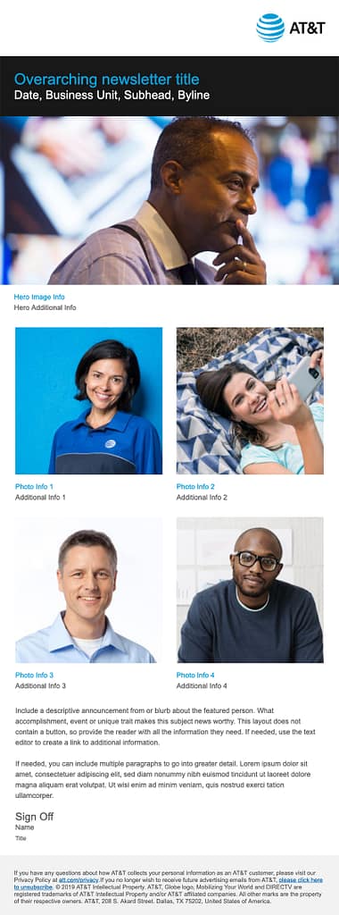
With the success of the first phase of responsive emails, we were asked to create an additional set. The first round focuses on providing information to consumers in a quick easy to read format, while the second round contains newsletter formats intended for internal communications.
In this email, users select from one horizontal image, two square images, four square images, or a combination of those options. These options result in a range of one to five total images. By leaving a field such as “photo info” blank, content is removed from the final customization. Other options for lengthier copy under the images are also available.

Digital signage:

The digital signage template above is exportable in 5 different sizes from one template. Users select from one of the pre-uploaded, brand approved images or upload and crop their own. Since the copy overlays the photo, we provide the opportunity to move the text and logo from right to left.
This option provides the opportunity to place the copy over an area of the selected image with the highest possible contrast. Also, the type can be set in a range of brand approved colors and weights for additional contrast. Plus, a variety of logos are available to provide the brand required contrast.
In the smallest output, the format shifts, and the quantity of copy reduces due to the small size and proportions. Other AT&T logos are used in the environment where this tiny output is used and therefore are not included in this output.
Print templates:
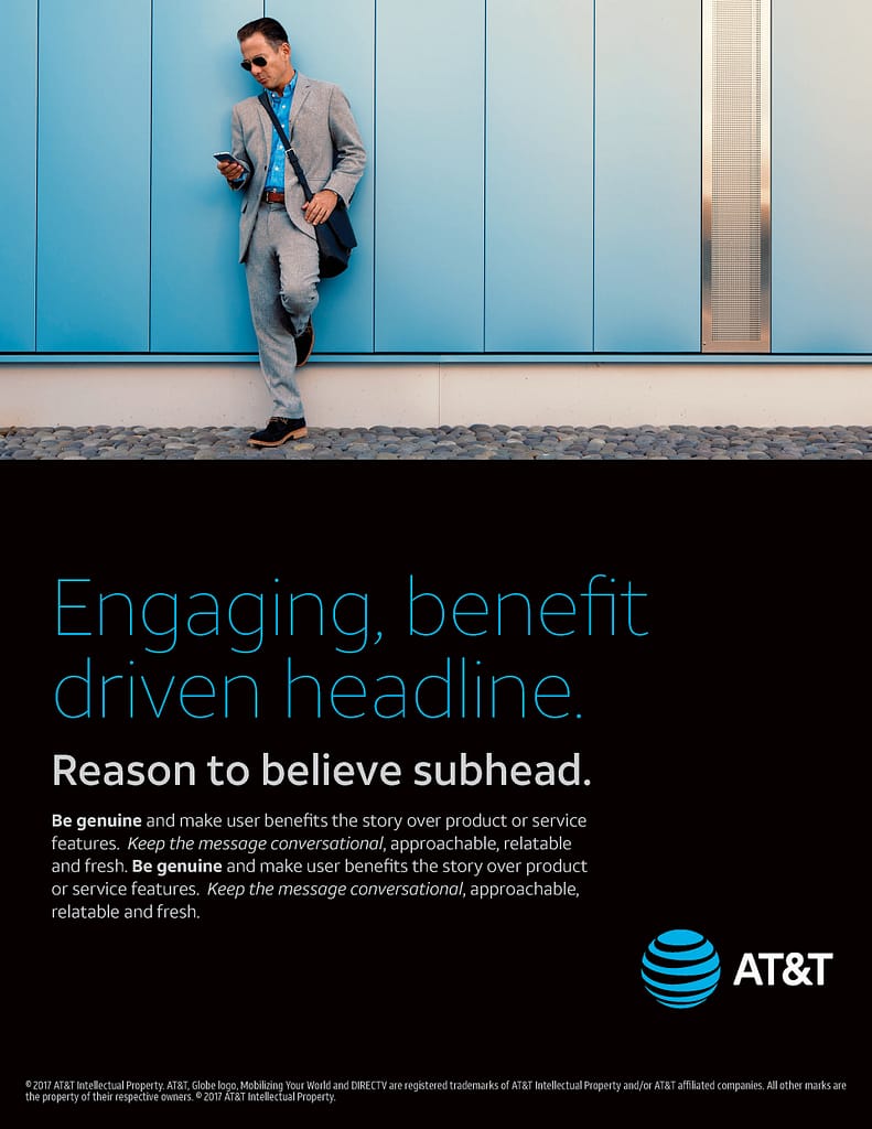
The images below show four different templates with varying degrees of emphasis on copy and image. The features are similar to the previous template with the addition of being able to change the fields of color to other preapproved brand colors.
These documents, however, are designed for print as opposed to digital signage. While some print files are set up to export in a range of sizes, these are only available in vertical letter format. Print templates export low res or press-ready PDFs.

The first template uses a large field of color without images and includes two columns of copy, with a call-to-action and legal.

Option two contains a header image, an optional field of color, one column of body copy, and legal text. Users can update the color fields to white, blue, black, gray, or light gray. Text colors can also be changed to maintain optimal contrast.

In the third option, we added a field of color for the headline in addition to the one behind the body copy. If a user only wants one field of color, they can set both areas to the same color, and it will appear as one continuous field.

The fourth option is similar to option three, except the content is reordered, and places emphasis on other subject matter.
User training
Video job aids:
We also create job aids as part of ongoing training efforts. We distilled this platform’s users into three distinct groups: template designers/developers, system administrators, and end-users.
This video speaks to end-users and therefore assumes viewers do not currently have any knowledge of the platform or its processes. It guides them through the entire procedure without excessive information. Then, we encourage the user to experiment with the templates.
Other videos we create for template developers or admins are far too technical and lengthy for the average end-user.